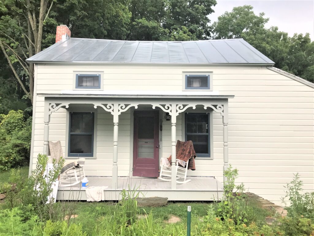
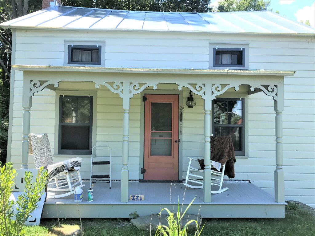
Yellow Ground. Hay. Brinjal. Book Room Red. Several trips to the hardware store and many coats later, Farrow & Ball’s Book Room Red triumphed and is now the “pop” of color on the otherwise muted façade of our latest rehab project, creeping towards completion.
This was a critical decision, not just because the house sits barely ten feet from the road. I felt strongly that the color should be bold, but also “of the house”. The rehabilitation had peeled back layers of paint from different eras, revealing a variety of hues. Sometimes, in the process of scraping, I would stand back and think, “There! That’s so beautiful!” – not the color itself, but the pattern of layers. In some places, it felt right to simply apply a clear coat instead of new paint to encapsulate the layers (of, yes, lead paint) and leave them exposed as a “window” to the past.
Among the grays and blues that prevailed throughout the interior, there were moments of robust, earthy colors like yellow ochre and terra-cotta red. Both directions seemed appropriate for the front screen door, especially since the clapboards and trim are Mizzle and Pigeon (also F&B), respectively. Though my instincts whispered terra cotta, I shied away from a “pink” door and went for yellow. My first try – Yellow Ground – seemed too insecurely assertive. My second try – Hay – looked downright meek by comparison. Our family had recently visited George Washington’s Mount Vernon, where I “discovered” and ultimately embraced glossy exterior paint. I took note of the vivid aubergine and teal doors. And so next I tried Farrow & Ball’s Brinjal, with great encouragement from my husband David, whose color sense is usually spot on.

While I love the color, it didn’t sit right on the house. Since I’d already veered into that part of the rainbow (and because I had draped a serendipitously colored Turkish rug over a porch rocker to air out), I finally took the plunge for pink – actually Book Room Red, a richer version of the Red Earth I had already applied to the interior staircase.

As they say, the fourth time is the charm. Perhaps 100 years – and many more layers of paint – from now, some other preservationist will discover “the yellow/purple/pink door” and smile.

